Posted 1 Jan 2009 (edited) A+ Wonder Girls! And they are kinda pretty Edited 1 Jan 2009 by Specever (see edit history) Share this post Link to post Share on other sites
Posted 1 Jan 2009 3/5 - Pretty plain. And I'm not fond of the writing. But The blue holiday thing looks good in 3.0... Everything else is freaked up. I really don't like 3.0... Share this post Link to post Share on other sites
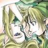
Posted 5 Jan 2009 hmm... something about hyrule army AND hobbes..... 4/5 Share this post Link to post Share on other sites
Posted 5 Jan 2009 0/5 - I never signed up to be one of your minions and I don't want to be one of your minions. I had the same discussion with Koltem and I don't want to go through all this crap again with you. Now, could you please remove it from your signature. Also, I dread how big your signature is going to be when you reach 100%. Share this post Link to post Share on other sites
Posted 5 Jan 2009 4/5. It's a tiger dude. And Sauron, Bathy is right. It will be huge. At least put comma's in between. Like this. Captain Tarrius the Conquerer, Fierce Muffin the Undefeated, HylianForrunner the Agile, Bathykolpian the Hobbes, Svanti Romero the Master of the Dead, Ganondorf333 the Corrupt, Chef Nonsense the Chef of Nonsense, Goron Merchant the Reknown, Dustin the All-Powerful, Dark Midna the Mirrior, Nyfer the Rogue leader, Specever the Doomsayer, Claire the Scum. Do that. It won't be as big. Share this post Link to post Share on other sites
Posted 6 Jan 2009 i'm going to be a little TOO honest here. xD 1/5 the overall plan of it is kinda' badly planned out, though the pics and the words are good. Share this post Link to post Share on other sites
Posted 6 Jan 2009 words..... 2/5 if your bathykolpian, dont reply next! Share this post Link to post Share on other sites
Posted 6 Jan 2009 ... 2/5 Size it down, please. It's too big. Share this post Link to post Share on other sites
Posted 6 Jan 2009 Yeah. I like it too. The Sinking Goron picture is great. 4/5 - I like the picture. It's... Weird. I have no idea what 'Margot and the nuclear so and so's' is meant to be, but it's funny nonetheless. Share this post Link to post Share on other sites
Posted 6 Jan 2009 It's a band. It's not supposed to be funny. DX 5/5. I wouldn't like it as much if I never saw your old one (since it's the same thing + Hobbes). But that brings up from like 2/5 lol. Share this post Link to post Share on other sites
Posted 6 Jan 2009 3/5 The pic is interesting and pretty well done, but I don't love it. It's so-so. Share this post Link to post Share on other sites
Posted 7 Jan 2009 3/5- Nice use of color and symmetry, though it could be a lot more interesting. Especially that monogram banner. 3/5- Nice use of color and symmetry, though it could be a lot more interesting. Especially that monogram banner. Share this post Link to post Share on other sites
Posted 7 Jan 2009 4/5 It's not very colorful, but doesn't need to be. It looks nice, and I love green text. What font is it? Oh, and what does Monogram mean? Lol Share this post Link to post Share on other sites